I'm re-branding. Slowly. Not slowly from reluctance but from practicality - I just don't have the time to do it all at once. I had planned to revamp my website during our long stay in France this summer but of course we're not going at all this year now and life in Stroud gets filled up with other things so I don't really have time for the website at the moment. I have time for little bits and pieces, though.
I've always been aware of the concept of a brand, I think, though I wouldn't have called it that. In recent years 'brand' has become a phenomenon, buzz-word or whatever other term you wish to use for something that is 'in'. And I am distinctly ambivalent about 'in' things.
Clothes fashion is a really good example of this. In choosing what to wear I've never been one to follow fashion, really, other than when I was at college. There, fashion was mostly what I was engaged in, although even then, while we were following the general trends of what might be called 'high fashion' of the times, we were also supposed to be creating our own styles and mine, though influenced by the top designers and particularly Zandra Rhodes, was already recognisable. After college, though, clothes returned to being something that everybody just got on and wore and my style soon became pretty informal and unrelated to fashion. Periodically the clothes that come into fashion interest me more and at other times my favourite colours turn up as the colours of the year but by and large fashion trends and I have little to do with each other.
What I hate, though, is consumerism and the extent to which fashion and brand drive it. That people with not much money feel driven to replace perfectly serviceable items because the colour and shape isn't 'in' this year is, I think, what is behind many of the ills of our modern world. I've no wish to sound like an old fogie and drive my readers away so I won't go on about this, but suffice to say it couldn't matter less to me who has made my shoes so long as they feel comfortable, don't fall apart and I find them visually pleasing. (If you care, I wear Crocs during as much of the year as I can get away with them as they are amongst the few shoes I have ever owned which fulfil all three criteria.) But kitchen appliances, hi-fi equipment, three-piece suites and even wallpaper should not be replaced because they are not in the latest style if they are still in good order and do the job you want them to do.
So then, as a consumer, I'm mostly not keen on the whole brand thing. But here's where Ms Jekyll turns into Mistress Hyde, I'm afraid. As a manufacturer, Brand is important to me.
At Gloucestershire Arts & Crafts Centre we have more than 50 different makers selling in the shop at any one time. Some sell better than others and I'm convinced that this is often linked to whether or not they have a recognisable brand. When new people join, if they don't have much experience in selling their work we try to encourage them to think about their brand, or image. The worst way to sell is to be skilled in many crafts and display them all together. If among those things you've made are some pottery mugs, you need to provide a reason for the customer to pick your mug out of your mixed display instead of buying one of mine from a display of nothing but pottery. We all do it as shoppers - look at a display and in a split second make an assessment of what is being sold - and if that assessment doesn't come up with a clear concept, we tend to move on to something that has. Over more than twenty-five years of involvement in the arts and crafts business I've seen that the best sellers are always people whose brand is clearly recognisable.
Exactly because I do diversify more than most, it's always been important for me to present my work in a way that shows it clearly as mine. Working in both ceramics and textiles I can sometimes be seen as a bit of an amateur. I have been turned down for craft groups for reasons along the lines of if I was a proper potter/textile artist that would be all I do. I can understand that view even though in my case it's erroneous. I'm professional in all the things I make and more dedicated than many to my work. But so that other people recognise this I need to make sure I have an observable brand.
To some extent this was helped when I built my first website. Needing a domain name, I knew I had "The One" as soon as I thought of Cloth and Clay. It's what I do and it rolls of the tongue. Stage one achieved. In part 2 I'll write about my current rebranding project.
Saturday, July 9, 2011
Tuesday, June 28, 2011
Choices

Do you remember the old adage, "The camera never lies"? You don't hear it any more because it's now commonly known to be untrue. These days the camera and its associated software can be made to tell all kinds of extravagent lies. The saying was useful, though. It was shorthand for so many situations where you thought you'd taken a photo of one thing (a friend at her 21st birthday party) and found instead you'd perfectly captured the disgusting state of a row of teatowels distastefully displayed behind the birthday girl's head.) Or a photo of what you thought was a beautiful view which turned out to be of several pylons and numerous cables strung right across your eyeline. Well, here's another good example of the camera not lying. My old bag.
As an aside: I was never really a rebellious teenager. The most I ever got to was calling my mum an old bag occasionally. She usually retaliated by reasoning that if she was an old bag, I must be a baguette. It took the steam out of the insult and annoyed me very much.
This, however, really is my old bag. I've had this bag for possibly 15 years. When new the colours were rich purple and pink. Now even the leather section (what's left unshredded, that is) is more grey than purple. The thing is that it has probably looked disreputable for some time but I've chosen not to see that. This photo makes it unavoidable. I've loved this bag. It has the right dimensions. It takes all the usual financial essentials like purse and cheque books plus emergency medical supplies (including insect repellent and antihystemine cream for when the former fails), camera, umbrella, dog poo bags, keys, pens, pencils, emery boards, and tissues. When required it can also hold small shopping and/or a wine bottle. Its days were clearly numbered, though. A couple of the straps had split halfway across and it was only a matter of time before one of them continued its journey and the aforementioned contents were distributed across a car park or supermarket floor.
So, choices. No, not choice of bag. Choice of how to spend a small pocket of time. There were so many things I could have spent this time on that I have not seemed to find time for over the last year or so. Highest on my list has been visiting friends but there are other things I wish I could get back to doing also. But instead I chose to spend the time making a new bag.

It is rather splendid, though I say it myself. It's not that obvious that the leather is synthetic and it is wonderfully purple. It cost me £5 for the main fabric for a piece more than a metre square (more than half of which is left over) plus about £6 for three zips.

Inside is a central compartment which is zipped and has a rigid central divider so those important paper items like cards don't get crushed. The central compartment doesn't go all the way to the bottom so that a couple of rarely needed things can lurk underneath, across the whole width of the bag. There are two small pockets on the outside of the central section too. The lining is specially created patchwork. There is a zipped outside pocket for keys and pens. The base is reinforced for rigidity to stop the whole thing falling over. There's a handy loop for pulling the bag towards you when you feel lazy.
I can't remember the last time I actually sat down and made something that wasn't work. The fabric was more difficult to work with than I expected but still I had fun making it and will have even more fun using it.
Wednesday, June 15, 2011
Beastly pots
It was Another Beastly Art Exhibition last weekend. Sadly, not a great success because Painswick has become a very quiet village. We'd hoped that there would be plenty of people about for Open Studios but it turned out that there is only one Open Studios venue in Painswick this year. Add to that the weather - horizontal rain on Sunday - and it was never going to be busy.
Sitting in the exhibition with no customers meant some time to spare, though, and I took my camera, my laptop and my (fairly) new graphics tablet. The reviews I read before buying the graphics tablet did mention time needed to get used to it and I haven't really had that time available until now, so a rather small silver lining must be admitted in that I was able to start to get more familiar with the graphics tablet. And it's really rather nice.
Anyway, here's a small selection of recent beastly pots, all of which appeared in the exhibition and all of which, sadly, came home with me, starting with a rather better picture of the lizard vase I blogged about under the heading of "Work in progress".


I like all of these, in different ways for different reasons. This last vase, though, is possibly my favourite.
Sitting in the exhibition with no customers meant some time to spare, though, and I took my camera, my laptop and my (fairly) new graphics tablet. The reviews I read before buying the graphics tablet did mention time needed to get used to it and I haven't really had that time available until now, so a rather small silver lining must be admitted in that I was able to start to get more familiar with the graphics tablet. And it's really rather nice.
Anyway, here's a small selection of recent beastly pots, all of which appeared in the exhibition and all of which, sadly, came home with me, starting with a rather better picture of the lizard vase I blogged about under the heading of "Work in progress".


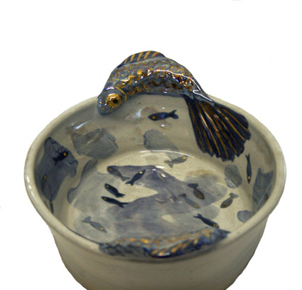


I like all of these, in different ways for different reasons. This last vase, though, is possibly my favourite.
Saturday, May 21, 2011
The greenhouse project is plumbed

This may be the most uninteresting picture you'll ever see on a blog and it may even be the most uninteresting blog post too, so I'll keep it short.
We have plumbing! You can see here on the left a tap with hose attached. Going up from there is more pipework and you can see a tap at the top centre of the picture. This one is for the watering system in this end of the greenhouse. Lower and to the right of the picture you can see through to the other end where the tap with a bit of hose stuck on awaits the watering system in that end of the greenhouse.
That's it. Plumbing in greenhouse. Really nothing more to say.
Except how pleasing it is.
Thursday, May 19, 2011
Work in progress - 5
Well, not really in progress any more as the lizard vase I've been documenting here is now finished. Here he is:

It's hard to photograph shiny things but I was very pleased with the vase so couldn't wait to have a go and post the pic here. I may have another go some time later.
The kiln was packed with pots I'm very happy with, most of which will remain uncovered until the exhibition in a few weeks time, but I'm delighted to share this chap with his loyal followers!

It's hard to photograph shiny things but I was very pleased with the vase so couldn't wait to have a go and post the pic here. I may have another go some time later.
The kiln was packed with pots I'm very happy with, most of which will remain uncovered until the exhibition in a few weeks time, but I'm delighted to share this chap with his loyal followers!
Wednesday, May 18, 2011
Work in progress - 4

The lizard has survived the first firing. (Actually, several lizards have, but this is the one everyone has been following.) The green is perhaps a little pale but it's difficult to get right. If it is applied too thickly it will run straight down the pot in a spectacular fashion, so it's better to err on the thin side on the whole.
Applying the lustres requires even more imagination than applying glazes because here none of them remotely resemble in the raw stage what they will look like after firing. Then there are other complications. I may have written before about the green/purple dilemma. Basically, green and light green lustres come out as purple and light purple - except when they don't! What to do? If the green went green then it would be ideal for this lizard. But if it went purple then I'm not so sure it would do much for the light green. It goes purple much, much more often than it goes green, so I decided not to risk it. Instead, I went for turquoise lustre, which is fairly bluish usually, but perhaps not too far from the light green base. I like to use gold with the green too. Finally, wanting to make the chap really lizardy, I used a fair amount of mother-of-pearl lustre. Below is what he looked like once decorated.

I can't be sure how this will all look, but I can be certain that it won't look anything like it's unfired state. The kiln is firing as I type. Tomorrow I will unpack and the vase will be finished and, with any luck, will still be in one undamaged piece. I'll let you know.
Tuesday, May 17, 2011
Oatmeal

I believe in the US "oatmeal" is sometimes used in place of the word "porridge". At least, when watching films or TV I've heard parents tell children to eat their oatmeal and seen a bowl of something looking porridgy. Anyway, this is definitely a bowl of porridge (with demarara sugar and double cream, since you ask) but it is in a cereal bowl with the glaze/design name of "oatmeal star". You can just see two tips of a greenish star poking up above the cream, but you can certainly see the overall colour of the pot so if I'm right about the US terminology you could say this is an oatmeal bowl of oatmeal.
As with all of my glazes, this one varies according to exact temperature, which usually means the position in the kiln as well as the temperature I have fired to. This oatmeal star design had been for many years sold only in The Made In Stroud Shop but in the last couple of years has begun to see the wider world and this particular bowl is the first one owned by me.
I rarely keep what I consider to be the nicest pots for myself. I rarely add a new design to my own kitchen collection either. This is mainly because of storage space in the kitchen and the fact that my pots are quite robust and don't tend to break unless treated badly. The cereal/soup bowl stacks have a little more room available so when this one came out of the kiln I decided it must be mine.
What I liked was the particular range of colours. The reduction was really good, in other words there were more than the usual scattering of speckles in the colour, the background colour itself is a soft, well, oatmeal colour, but with slight tinges of light blue where it had caught some extra heat. Yum. And so was the porridge.
Subscribe to:
Posts (Atom)